Creating Waffle Charts in R for infographics
Came across this pretty cool post to create waffle charts using R.
I had to install fontawesome font on my mac from Font Awesome. First download, then double click fontawesome-webfont.ttf and FontAwesome.otf. Mac OSX then gives an option to "Install Font". Go ahead and install and it installs into ~/Library/Fonts. Now copy the fonts from ~/Library/Fonts to /Library/Fonts. That's it! Font Awesome should be ready to go!
The follow script generates pretty neat looking charts that you see in infographics!
install.packages(c("waffle", "extrafont"))
library(waffle)
library(extrafont)
font_import()
# check that Font Awesome is imported
fonts()[grep("Awesome", fonts())]
# [1] "FontAwesome"
# this should be fine for Mac OSX
loadfonts()
# use this if things look odd in RStudio under Windows
# loadfonts(device = "win")
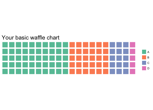
# Chart 1
waffle(c(50, 30, 15, 5), rows = 5, title = "Your basic waffle chart")
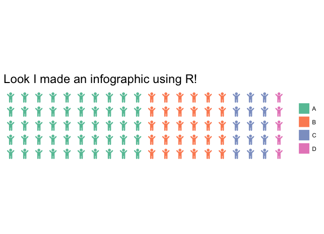
# Chart 2
waffle(c(50, 30, 15, 5), rows = 5, use_glyph = "child", glyph_size = 6,
title = "Look I made an infographic using R!")
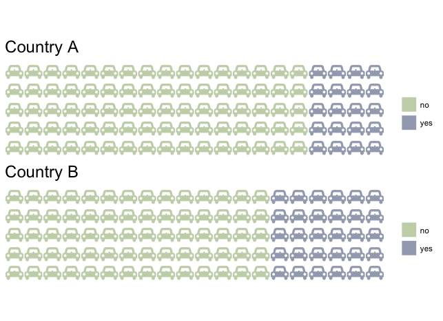
# Chart 3
iron(
waffle(c(no = 80, yes = 20), rows = 5, use_glyph = "car", glyph_size = 6,
colors = c("#c7d4b6", "#a3aabd"), title = "Country A"),
waffle(c(no = 70, yes = 30), rows = 5, use_glyph = "car", glyph_size = 6,
colors = c("#c7d4b6", "#a3aabd"), title = "Country B")
)