Displaying a Sector Return Performance Chart using R and Licorice
I learned an interesting way to plot a Likert scale from my feed of R-bloggers that referenced some pretty cool recent work done by Bart to plot Likert-like data.
I was looking for a place where I could use his work in a field of my choice and came upon this chart at Google Finance.
The sector summary chart in Google Finance looks like this (pretty much like a Likert scale?).
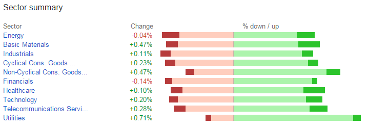
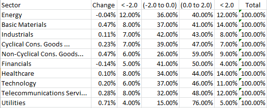
This seemed a good idea to play with! I plotted out the data using the tool tips on the Google Chart and here is the data!
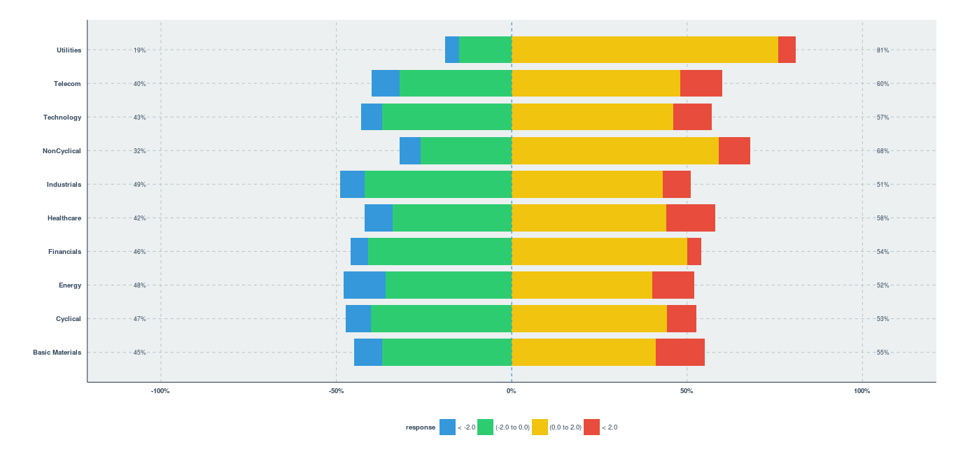
Next, I imported the data using hadley/readxl into R and played around with the code on licorice page to create a similar chart.
So here is the final output! Looks cool!?