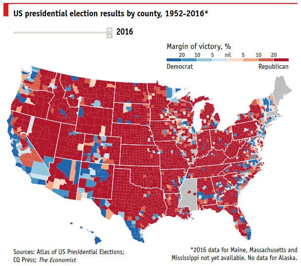
County level choropleth of the US Presidential Elections Results (2016)
The historic election victory of Mr. Trump will be a motivator of posts by data analysts for quite sometime! Here is my attempt to replicate the choropleth shown in this Economist Daily Chart on country divided by counties.
As a side note, Many thanks to Ari Lamstein for his various posts and packages to help beginner analysts like me to produce fairly good analyses and visualizations.
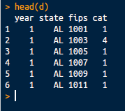
Inspecting the link in Chrome Dev tools gave me access to the dataset which appears practically read to analyze! The dataset made available here for reproduction purposes.
The dataset shows the margin of victory displayed by the cat field.
Meant to represent the "category" as shown in this original screenshot below:
I'll attempt to replicate this chart using the Ari's packages. My goal is to make a near replica of it (and I've made few cleanup to hack together a valid set as accuracy isn't my primary goal here!).
Also, the dataset contains the history for a lot of years (yay!) but I will analyze this only for 2016 shown by year = 17
My code is as follows. I load some frequently used packages but don't necessarily use all of them here.
require("data.table")
require("RJSONIO")

library('readr')
library('choroplethr')
library('choroplethrMaps')
library('ggplot2')
library('ggthemes')
library('RColorBrewer')
library('gridExtra')
library('dplyr')
library('stringr')
library('tidyr')


d <- read.csv("data-files/election-data_10-11-2016.csv")
dt <- as.data.table(d)
dt_2016 <- dt[year == 17]
dt_results <- dt_2016


data("county.regions")
dt_county_regions <- as.data.table(county.regions)
dt_county_regions[,fips:=region]

setkeyv(dt_results, c("fips"))
setkeyv(dt_county_regions, c("fips"))

dt_results <- merge(dt_results, dt_county_regions, all.x=TRUE, all.y=TRUE)
dt_results <- dt_results[!is.na(region)]
dt_results <- dt_results[!is.na(cat)]


dt_results[,value:=as.factor(as.integer(cat))]

library(RColorBrewer)
myColors <- c(sort(brewer.pal(4,"Blues")), brewer.pal(5,"Reds"))

choro = CountyChoropleth$new(dt_results)
choro$title = "Democrat vs. Republican distribution in the US Presidential Election (2016)"
choro$ggplot_scale = scale_fill_manual(name="category", values=myColors, drop=FALSE)
choro$render()
The output here:
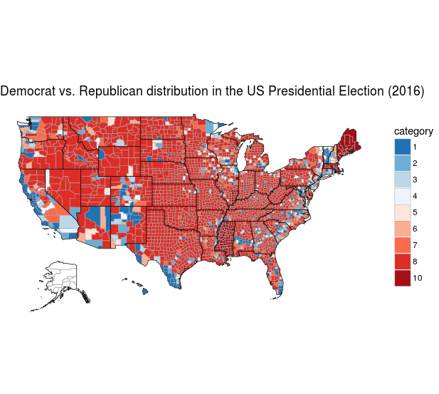
Close huh!? :-) (again .. not fully accurate)
An animation across years can be made using the same data which I'll save for another time! :-)