Creating R Charts with Dual Axes in R
Charts with dual axes have been a hot debate topic for quite a while now. I see merits in the arguments against using Dual Axes but then I often them convienient too.
I came across this post from R-Bloggers on creating Dual axes time series plots
Modified it slightly to get to the part of interest to me. Original source is available here
usePackage <- function(p)
{
  if (!is.element(p, installed.packages()[,1]))
    install.packages(p, dep = TRUE)
  require(p, character.only = TRUE)
}

usePackage('readxl')
usePackage('dplyr')
usePackage('tidyr')
usePackage('ggplot2')
usePackage('scales')
usePackage('ggseas') # for stat_index
usePackage('grid')
usePackage('gridExtra')


# Download data from the Reserve Bank of New Zealand
download.file("http://www.rbnz.govt.nz/-/media/ReserveBank/Files/Statistics/Key%20graphs/graphdata.xlsx?la=en",
              destfile = "rbnz.xlsx", mode = "wb")

# Import some of that data into R and create a numeric TimePeriod variable from the original
# string that shows year and month:
forex <- read_excel("rbnz.xlsx", sheet = "8_NZDUSD", skip = 4) %>%
   mutate(year = as.numeric(substring(DATE, 1, 4)),
          month = as.numeric(substring(DATE, 6, 7)),
          TimePeriod = year + (month - 0.5) / 12) %>%
   select(-DATE, -year, -month)

# Tidy up names:
names(forex)[1:2] <- c("NZDUSD", "TWI")

# Create a long, thin ("tidy") version for use with ggplot2:
forex_m <- forex %>%  gather(variable, value, -TimePeriod)

#------------dual axis version-------------
# As we're drawing a number of these, we want a function to make it easier.
# Here's one I prepared earlier:
source("https://gist.githubusercontent.com/ellisp/4002241def4e2b360189e58c3f461b4a/raw/9ab547bff18f73e783aaf30a7e4851c9a2f95b80/dualplot.R")

# bad:
with(forex, dualplot(x1 = TimePeriod, y1 = NZDUSD, y2 = TWI,
                     colgrid = "grey90", ylim2 = c(20, 200)))

# bad:
with(forex, dualplot(x1 = TimePeriod, y1 = NZDUSD, y2 = TWI,
	colgrid = "grey90", ylim1 = c(0, 1)))

# verybad:
forex2 <- forex %>%
   mutate(NZDUSD_growth = c(NA, diff(NZDUSD)) / NZDUSD * 100)
with(forex2[-1, ], dualplot(x1 = TimePeriod, y1 = NZDUSD, y2 = NZDUSD_growth,
	colgrid = "grey90", ylim2 = c(-15, 15)))

# ok:
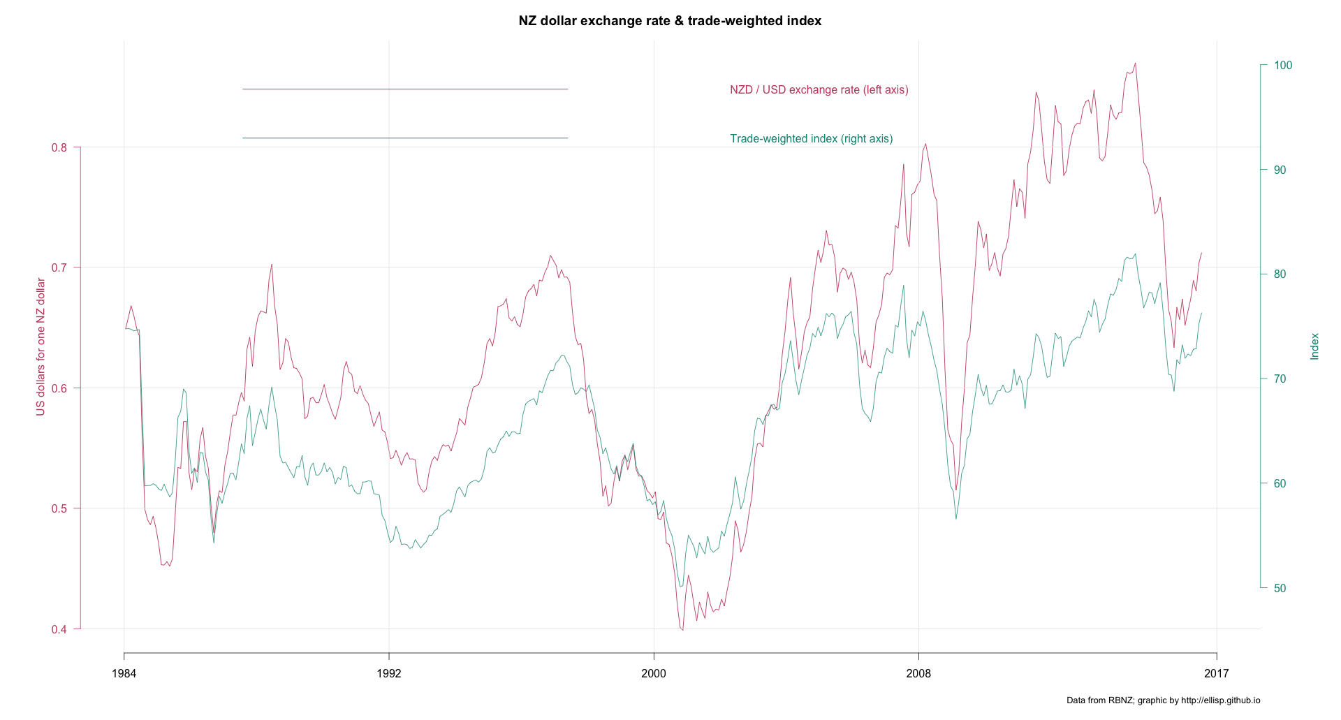
with(forex, dualplot(x1 = TimePeriod, y1 = NZDUSD, y2 = TWI, lwd = 1.2, colgrid = "grey90",
                     main = "NZ dollar exchange rate & trade-weighted index",
                     ylab1 = "US dollars for one NZ dollar",
                     ylab2 = "Index",
                     yleg1 = "NZD / USD exchange rate (left axis)",
                     yleg2 = "Trade-weighted index (right axis)",
                     mar = c(5,6,3,6)))
mtext(side = 1, "Data from RBNZ; graphic by http://ellisp.github.io",
	adj = 1, cex = 0.8, line = 3)

# ok again, equivalent to reference point for indexing of January 2014
with(forex, dualplot(x1 = TimePeriod, y1 = NZDUSD, y2 = TWI, lwd = 1.2, colgrid = "grey90",
				 main = "NZ dollar exchange rate & trade-weighted index",
				 ylim.ref = c(361, 361),
                 ylab1 = "US dollars for one NZ dollar",
				 ylab2 = "Index",
				 yleg1 = "NZD / USD exchange rate (left axis)",
				 yleg2 = "Trade-weighted index (right axis)",
				 mar = c(5,6,3,6)))
mtext(side = 1, "Data from RBNZ; graphic by http://ellisp.github.io",
	adj = 1, cex = 0.8, line = 3)

#--------tidy up-----------
unlink("rbnz.xlsx")
The best chart from the above code is:
