Visualizing rural and underserved counties in the US
The CFPB recently published their list of rural and underserved counties in the US for 2016.
Unfortunately, the data is in a PDF (terrible open data format), and we need to extract the data from the PDF before we can begin to use it for our analysis. Tabula is a blessing for this scenarios. Lets try using Tabula to extract the data out of the PDF.
Today is our luck day! Fortunately, the data was formatted neatly to be parsable by Tabula and data extracted to a csv file just perfectly!.
Merging the County FIPS data available from the census website and the data from CFPB, we can generate a choropleth of the underserved counties in the US.
Here is the visualization generated!
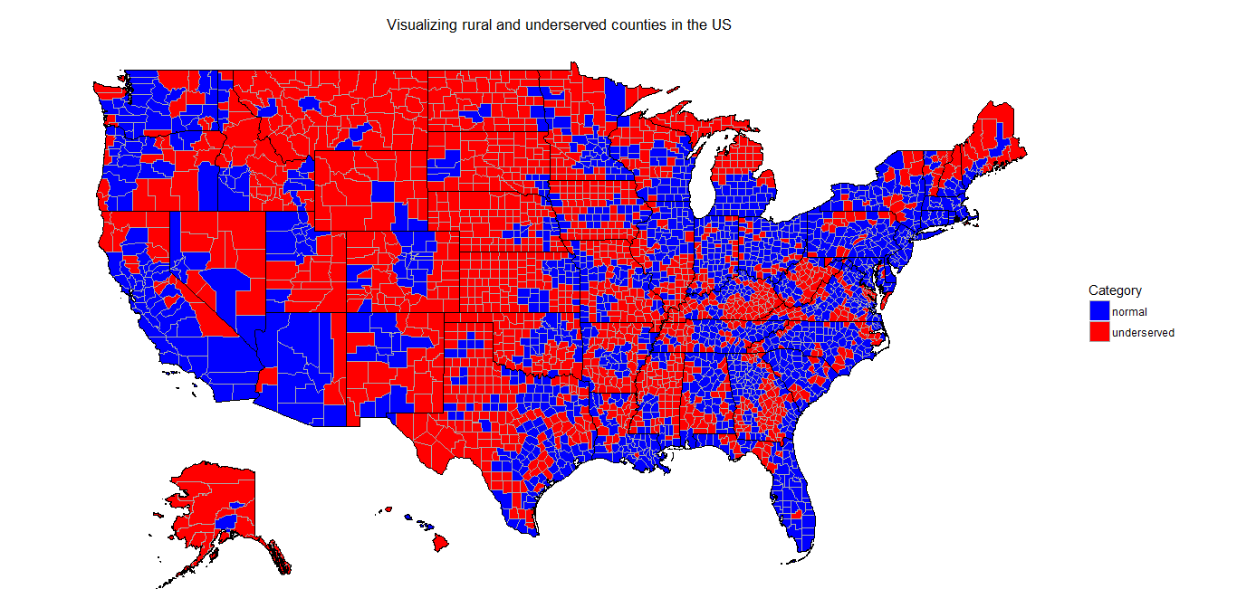
Particularly noteworthy, is the contiguous region in red in the central part that is so massively underserved!